
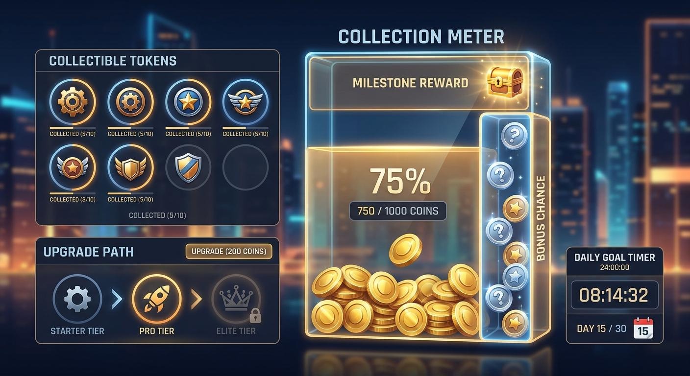
Collection meters are visible progress systems that show you how close you are to a goal. You gather tokens, fill a bar, add items to an album, or watch a counter climb towards a threshold. It’s a simple idea, but it gives repeated play a clear short-term purpose.
For DailyGame readers, the appeal is easy to recognise. A good meter answers the question that pops up after every round, match or level: “What should I do next?” Rather than leaving progress vague, it turns it into something you can see, read and plan around.
Money-themed versions often use coins, piggy banks, vaults or stacks of notes as visual shorthand. The theme is familiar, but the real design work lies in the loop underneath. Players are not responding to an icon alone. They’re responding to understandable feedback, a visible destination and the feeling that their actions are moving the display forwards.
The loop is usually more practical than it looks
Most collection systems follow a recognisable pattern:
- Do an activity
- Receive a resource
- Watch the meter change
- Reach a threshold
- Begin a new target
That structure appears in all sorts of places. Arcade games used score tables and extra-life thresholds to make each run readable. Puzzle games often use stars and chapter maps. Mobile games may tie resources to upgrade paths, while social games can make collections a reason to return to a shared event.
The key is not complexity. It’s clarity.
If a player can tell what they collected, where it has gone and what it contributes towards, the next decision feels straightforward. If they can’t, the system becomes background noise. You’ve probably seen this in games with several currencies, overlapping menus and tiny symbols that need a glossary. There may be plenty happening, yet very little feels meaningful.
A strong collection meter tends to make four things obvious:
- what counts towards progress;
- how much progress has been made;
- what happens at the next milestone;
- whether progress carries over, expires or resets.
That last point matters more than designers sometimes admit. Reset points can be satisfying when they create a fresh challenge, but frustrating when they arrive without warning. A visible countdown, a clear event timer and plain language about what remains are small touches that respect the player’s time.
Why watching a number rise feels so compelling
There’s no need to make grand claims about a progress bar. It does not guarantee enjoyment, and it certainly does not make every reward system worthwhile. Still, it can make a game easier to understand and more pleasant to return to.
Part of that comes from anticipation. When a meter is nearly full, the next few actions have extra context. You know what you’re working towards, even if the activity itself is familiar. A task that might otherwise feel routine becomes part of a visible sequence.
Perceived agency matters too. When players can choose between routes that produce different resources, or decide whether to save tokens for one unlock rather than another, they have a meaningful role in the loop. The decision does not need to be huge. Even a modest choice can make progression feel more personal.
Variable feedback adds another layer. Some actions may give a standard amount, while others offer a bonus, a rare piece or a multiplier. Used carefully, this breaks up repetition. Used without explanation, it can make a system feel arbitrary. The difference is whether players understand the possible outcomes and the rules behind them.
Then there’s near-completion tension. A collection sitting at 19 out of 20 has an obvious pull because the missing piece is visible. That can be enjoyable in a game built around discovery, provided the route to completion is fair and communicated plainly. If a player has no way to judge whether the final item is obtainable through normal play, the excitement can quickly turn into annoyance.
None of this works without legible interface design. Numbers need enough contrast. Icons need labels. Progress should be visible at the moment it changes, not buried three menus away. The UK Government’s discussion of loot boxes and video games also underlines why clear information around chance-based systems matters. Players should be able to distinguish earned progress from uncertain outcomes.
Different genres, different rhythms
Collection meters are not one-size-fits-all. Their pacing needs to suit the game around them.
Arcade score-chasing
Classic arcade design makes progress immediate. Score ticks upward, targets become harder and a leaderboard offers a simple comparison point. There is rarely much inventory management. The meter is the run itself.
This works because the feedback is fast. Every successful move is acknowledged. For a modern score-focused game, the lesson is to keep the display clean and the connection between skill and score obvious.
Mobile upgrade economies
Mobile games often combine several progression paths: experience levels, upgrade materials, daily objectives and limited-time events. That can create plenty of options, though it can also become cluttered.
A player-friendly approach gives each resource a distinct job. If one item upgrades equipment and another opens cosmetics, say so. Avoid presenting five counters before the player has learned why any of them matter. A good rule is that a new resource should answer a new question, rather than duplicate an old one.
Social-game collections
Social games often frame collection as a shared activity. Players may contribute to group goals, exchange duplicates or compare completed sets. The social side can make a familiar task feel more lively, especially when everybody can see the same event target.
Transparency is essential here. Explain whether rewards are individual or shared, whether progress is personal or communal, and exactly when an event ends. Nobody enjoys discovering that a collection window closed while a reward was one step away.
Loot-led progression
Loot-driven games use equipment, character items or crafting parts as long-term motivators. The appeal comes from both accumulation and possibility. You might improve a build, complete a set or find an item that changes how you play.
Designers should be careful not to hide vital information. If an item is random, say so. If duplicates can appear, say so. If a collection has a fixed endpoint, make it visible. Clear odds and descriptions do not remove uncertainty, but they do let players make informed choices.
A quick checklist for a satisfying meter
Whether you’re assessing a game or building one, these questions are useful:
- Can you explain the goal in one sentence?
- Is every resource clearly named and visibly counted?
- Does each action produce feedback you can understand?
- Are thresholds and rewards shown before you reach them?
- Is chance clearly separated from guaranteed progress?
- Are timers, resets and event rules easy to find?
- Does the pace leave room for variety, rather than asking for the same task too often?
- Can you step away without losing track of what matters?
I find the strongest systems make the player feel informed, not hurried. They offer a reason to continue, but they don’t rely on confusion to create interest.
From arcade scores to collection-heavy games
The history of game rewards is, in many ways, the history of making success visible. Arcade machines turned skilled play into points, high-score tables and occasional milestone rewards. Home games expanded that idea with unlockable levels, secret routes and completion percentages.
As online, mobile and social games grew, progression became more persistent. A session could now contribute to a longer project: filling a collection book, improving a character, decorating a space or completing seasonal objectives. Money imagery became common because it instantly communicates accumulation, but it remains only a presentation layer.
The important distinction is between earned progression and chance-led outcomes. Earned progression tells you what action moves the meter. Chance-led outcomes may offer a range of possible results. Both can exist in the same game, but they should never be blurred together. Clear presentation helps players understand what is within their control and what is not.
Related example: collection mechanics in a slot-game context
The big piggy bank slot provides a separate example of piggy-bank and collection-style visual framing in a slot-game setting. Slot play is strictly 18+ and should be approached as entertainment, with responsible-gambling support available through the Gambling Commission’s safer gambling guidance where appropriate.